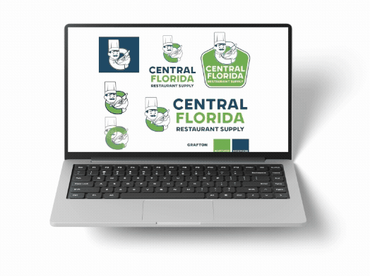
Logo Design: Central Florida Restaurant Supply
When Central Florida Restaurant Supply prepared to open its new store in Winter Haven, they knew they needed more than just stocked shelves. They needed a brand identity that reflected their role in the foodservice industry. From kitchen smallwares to larger equipment like walk-in coolers, and everything in between, their store offers the everyday essentials restaurants rely on to run smoothly. Their goal was a logo that customers could instantly connect with the restaurant supply industry while helping them stand out from local competitors.
The Design Process
We started by sketching concepts in Procreate, quickly exploring different directions that could capture the client’s vision. From there, we refined the strongest ideas in Adobe Illustrator, creating polished versions that could adapt across different formats, like horizontal, vertical, or badge-style layouts.
Our first round of concepts included:
-
A chef pan emblem
-
The state of Florida outlined with kitchen items
-
A cutting board and butcher knife forming the letters “CF”
-
A chef character stirring a mixing bowl inside the letter “C”
Each design was developed to stand apart from the typical chef hats and knife logos used by competitors, offering a more original and memorable identity.
Refinements and Feedback
After presenting the first round, the client provided valuable feedback:
-
Remove the chef pan concept
-
Adjust the Florida outline to make the shape more recognizable
- Change the color to green to see if the Florida shape comes out more
-
Incorporate an “F” alongside the chef character for balance
With these changes in mind, we created updated versions and mocked them up in real-world applications such as signage, business cards, shirts, and marketing materials. This helped the client visualize how their brand could live beyond the digital design stage.
The Final Logo
The winning design was the Chef with the CF, a playful mascot integrated into the brand name. The character not only made the logo approachable and memorable but also gave the client a versatile asset they could use in future marketing, such as animations, promotional graphics, and social media content.
Now, when customers see the chef, they immediately connect it with Central Florida Restaurant Supply. The mascot has become a powerful brand marker that sets the company apart in a competitive industry.
Impact
A strong logo goes beyond aesthetics, it becomes the face of a brand. For Central Florida Restaurant Supply, their new logo serves as a recognizable identity that builds trust, makes marketing more effective, and ensures that when people think of restaurant supplies in Winter Haven, they think of their chef mascot
If you’re ready for a new logo or a brand refresh, Creative Fox Group is here to help. We create bold, recognizable designs that capture your business and set you apart from the competition. Logos, websites, or full brand identities that leave a lasting impression.